
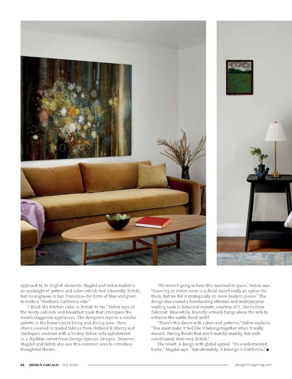
designchicagomag.com 46 DESIGN CHICAGO THE MART approach to its English elements. Magdol and Oehm traded in an onslaught of pattern and color—which feel inherently British, but incongruous in San Francsico—for hints of blue and green to evoke a “Northern California vibe.” “I think the kitchen color is British to me,” Oehm says of the minty cabinets and breakfast nook that interspace the room’s Gaggenau appliances. The designers reprise a similar palette in the home’s joint living and dining area: Here, chairs covered in muted fabrics from Holland & Sherry and Harlequin contrast with a Nickey Kehoe sofa upholstered in a sky-blue velvet from George Spencer Designs. However, Magdol and Oehm also use this common area to introduce thoughtful florals. “We weren’t going to have this maximalist space,” Oehm says. “Covering an entire room in a floral wasn’t really an option for them, but we did it strategically on more modern pieces.” The design duo coated a freestanding ottoman and multipurpose reading nook in botanical repeats, courtesy of S. Harris from Fabricut. Meanwhile, branchy artwork hangs above the sofa to enhance the subtle floral motif. “There’s this dance with colors and patterns,” Oehm explains. “You must make it feel like it belongs together when it really doesn’t. Having florals that aren’t matchy-matchy, but well- coordinated, feels very British.” The result: A design with global appeal. “It’s a well-traveled home,” Magdol says. “But ultimately, it belongs in California.” n
 Design Chicago: Opposites Attract (Single Pages) Page 47 Page 49