
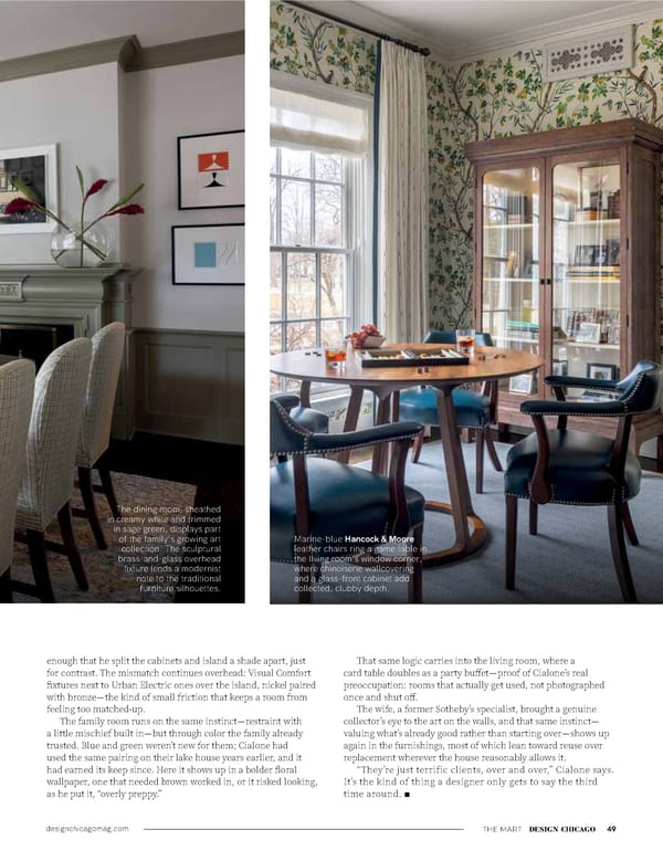
designchicagomag.com THE MART DESIGN CHICAGO 49 enough that he split the cabinets and island a shade apart, just for contrast. The mismatch continues overhead: Visual Comfort fixtures next to Urban Electric ones over the island, nickel paired with bronze—the kind of small friction that keeps a room from feeling too matched-up. The family room runs on the same instinct— restraint with a little mischief built in—but through color the family already trusted. Blue and green weren’t new for them; Cialone had used the same pairing on their lake house years earlier, and it had earned its keep since. Here it shows up in a bolder floral wallpaper, one that needed brown worked in, or it risked looking, as he put it, “overly preppy.” That same logic carries into the living room, where a card table doubles as a party buffet—proof of Cialone’s real preoccupation: rooms that actually get used, not photographed once and shut off. The wife, a former Sotheby’s specialist, brought a genuine collector’s eye to the art on the walls, and that same instinct— valuing what’s already good rather than starting over—shows up again in the furnishings, most of which lean toward reuse over replacement wherever the house reasonably allows it. “They’re just terrific clients, over and over,” Cialone says. It’s the kind of thing a designer only gets to say the third time around. n The dining room, sheathed in creamy white and trimmed in sage green, displays part of the family’s growing art collection. The sculptural brass-and-glass overhead fixture lends a modernist note to the traditional furniture silhouettes. Marine-blue Hancock & Moore leather chairs ring a game table in the living room’s window corner, where chinoiserie wallcovering and a glass-front cabinet add collected, clubby depth.
 Design Chicago: Design Refined Page 50 Page 52