
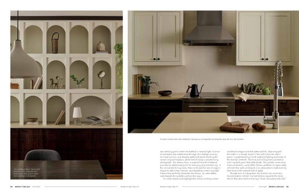
designchicagomag.com designchicagomag.com THE MART DESIGN CHICAGO 55 54 DESIGN CHICAGO THE MART eye-catching green velvet sits bathed in natural light. A sense of symmetry was established through chic tubular sconces, minimal mirrors, and shapely patterned stools flanking the room’s original fireplace, above which hangs a mesmerizing photograph. The Eames chair, a request from the husband, provides an additional perch for lounging and entertaining. In the connected dining room, Blue continued her use of organic shapes to add visual interest, punctuated by a stunning light fixture that perfectly illustrates the theme. An extendable, oval-shaped dining table anchors the space. To create drama and highlight the entry’s existing cream- and-black octagon-and-dot patterned tile, Blue wrapped the walls in a moody mural in the wife’s favorite color— green—complementing it with ambient lighting and some of the family’s artwork. The trim and ceiling were painted an enticing dark green that adds depth. The powder room went from a timeworn, early 2000s Tuscan aesthetic to impeccably refined—the walls enveloped in an atmospheric wallcovering that mimics the natural look of agate. Though less of a departure, the kitchen too received a transformative refresh. Curved shelves opposite the stove, which Blue described as having a “drab, monastery-like feel,” Artisan-crafted tiles that celebrate the beauty of imperfection breathe new life into the kitchen. The kitchen’s dark, lackluster shelves were updated with fresh paint that accentuates their architectural appeal.
 Design Chicago: Opposites Attract (Spreads) Page 28 Page 30